QMplus Changes - 8th February 2023
On the 8th February we made some changes to QMplus.
These were all to fix small issues that had been found with our new theme as follows:
- Letters in participants list filter displaying blacked out
- Cog icon in scheduler activity overlapping
- Talis Aspire reading lists being cut off on the right
- Missing icon for "Insert Character" function in visual editor (Atto editor)
- Not being able to see all the icons in the left navigation bar
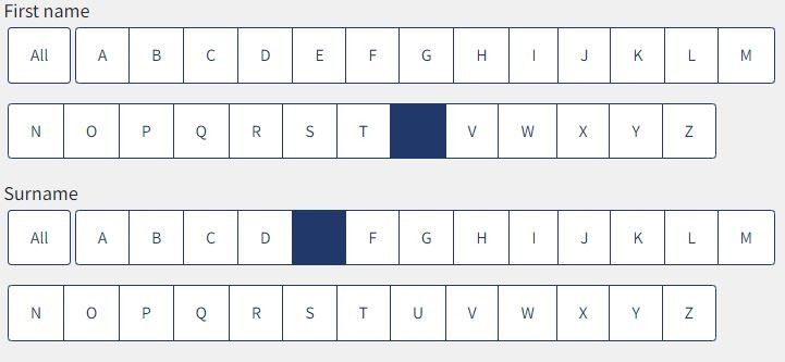
Letters in participants list filter displaying blacked out
When filtering the participants list, accessed via the participants icon in the left navigation menu, the buttons were appearing "blacked out".
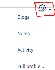
Cog icon in scheduler activity overlapping
 When using the scheduler activity, the cog icon giving access to the settings menu appeared overlapping. While this looked ugly, it didn't prevent access to the settings from working.
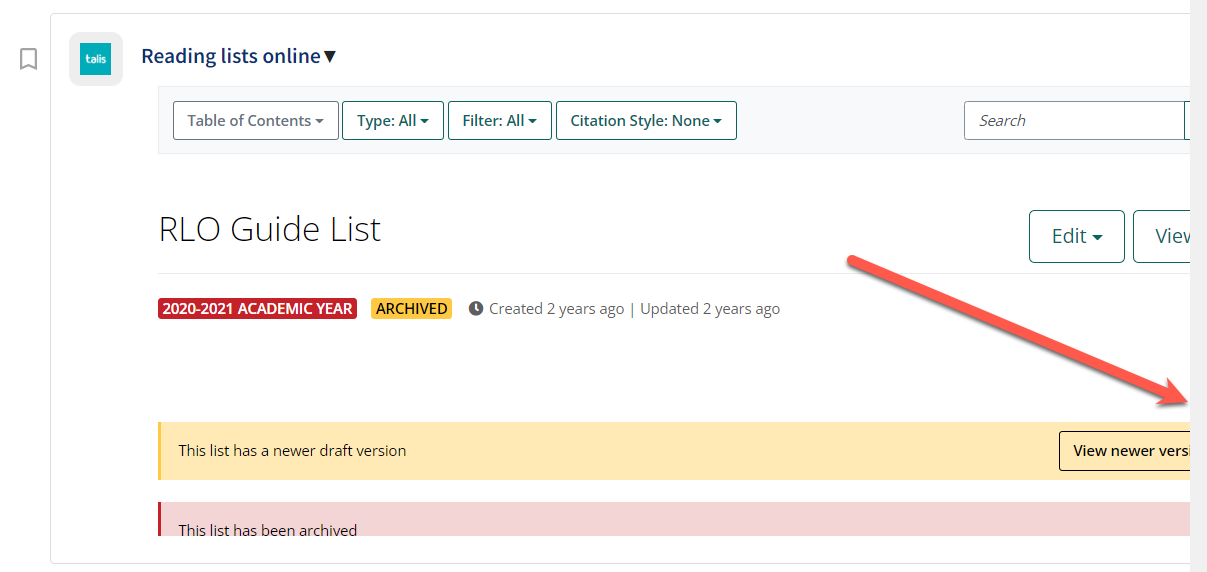
Talis Aspire reading lists being cut off on the right
When adding a Talis Aspire online reading list resource, the window was appearing cropped on the right so the contents were not all visible.
Missing icon for "Insert Character" function in visual editor (Atto editor)
![]()
When using the visual editor in QMplus (also referred to as the Atto editor), one of the icons was missing. This is the "Insert Character" button. The button still worked without the icon.
Not being able to see all the icons in the left navigation bar
![]() In some situations the background colour of the left navigation bar was lost making the icons difficult to see.
In some situations the background colour of the left navigation bar was lost making the icons difficult to see.

